1. Template selection
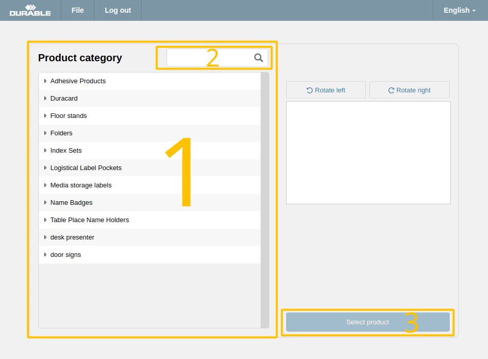
Select your desired product from the product list (1). You can use the filter field (2) to quickly find the required product by name or product number. Confirm your selection by clicking "Select product" (3).
Select your desired product from the product list (1). You can use the filter field (2) to quickly find the required product by name or product number. Confirm your selection by clicking "Select product" (3).
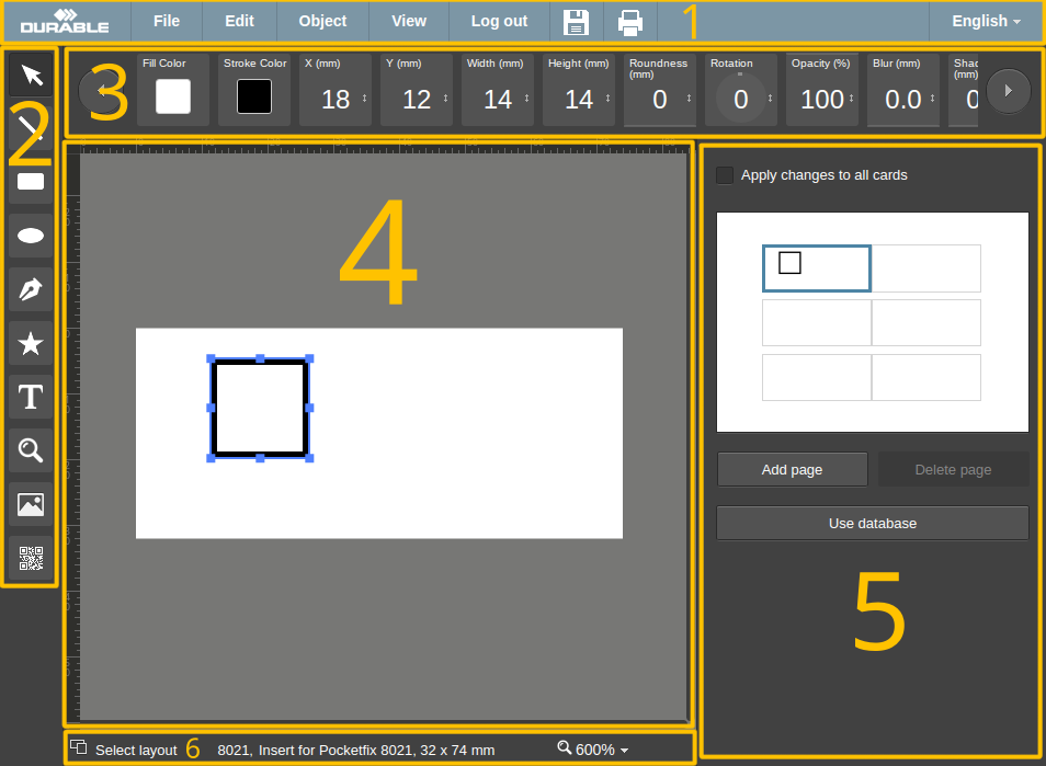
Main editor interface is divided into several functional areas:


Toolbar on the left provides various tools that allow adding of different elements to the project.
When this tool is active, you can select separate elements by clicking on them or by dragging a band around several elements and selecting them all at once.
After selecting one of these tools, you can add simple shapes by clicking and dragging the mouse in the work area over intended location of the elements.
This tool allows you to draw complex shapes, consisting of straight or curved segments. To append straight segment to the path, click the left mouse button. To append curved segment to the path, press and move the left mouse button until desired bend is achieved. To finish path creation and close path, click on the first point of the path.
You can select one of the pre-packaged complex shapes from in-application library of various images. Simply select required image from popup and drag with mouse on canvas near intended location of the shape.
Select this tool, click on the work area to place and edit the label. Click outside the label to finish editing.
This tool allows you to quickly zoom to some area within your project - simply select the desired area with that tool, and zoom and viewport position will be adjusted to display that area to the full size of the screen.
This tool pops up a dialog with several options for image loading:
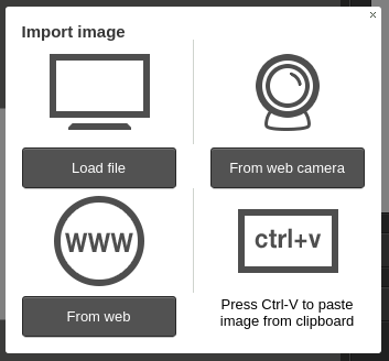
You can load image from local drive, take a shot with web camera (be sure to give application permission to use web camera, else this would not work), import from web link and paste image that was copied from some other site.
Barcode dialog allows you to encode some text or number in the form of graphical codes like QR-code, EAN13 and several others. You only need to input your text in the top text box, select barcode type and click "Done".
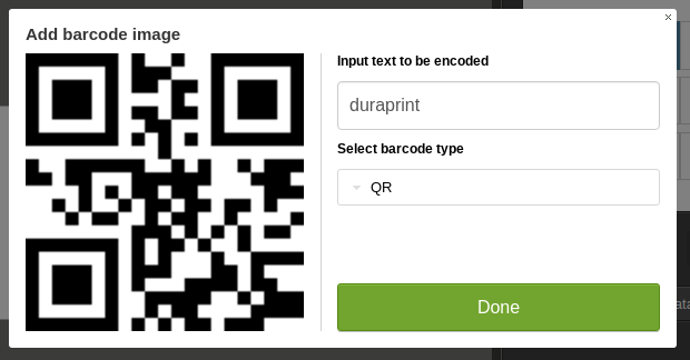
Any error that may occur will be displayed in red color right above the "Done" button.
Context panel contains controls that change properties of currently selected elements. Different elements have different properties, thus context panel content always changes, displaying only controls which are relevant at the current moment.
All numeric controls can be operated in two ways:
List of available controls:
This is the main area of the application - you design your product here, add/modify/delete shapes and text elements.
All elements can be dragged via holding left mouse button.
When an element is selected, selection handles appear and it can then be resized or rotated by dragging those handles around.
Overview panel is positioned to the right of the work area and provides quick summary of currently selected page with small previews of all cards on it.
Individual cards can be added, deleted, copied or pasted by selecting respective actions from context menu (right-click on the card). All card operations can be applied to several cards at once - hold Ctrl and click several cards, they will be all selected.
On the left, bottom panel contains a button that takes you back to the product selection screen. But even if you choose another product, your current card designs will not be lost - instead they will be transferred onto the new product.
Currently selected product number and description are displayed in the center of the bottom panel.
The selector on the right enables zoom level selection. You can also change zoom level by holding Ctrl and scrolling the mouse wheel.
To simplify mass-production of similar designs (for example, name badges for company employees), you can upload a table with your dataset, bind table columns to the elements in card design, and the resulting PDF file will contain cards customized for each row of your table.
First you need to create a table in one of supported formats (XLS, XLSX, ODS or CSV) in the software of your choice. Table columns must have the appropriate headers (e.g. Last Name, First Name, etc.).
Now you can upload the table into the application - press "Use database" button on overview panel and select your file. Uploaded table will be displayed in the bottom of overview panel. If required, you can edit some fields by double-clicking the table cell and typing in the value you need.
Now you can link data fields with the elements in your design by dragging-and-dropping fields from the table directly to your card.
Alternatively, you can right-click the element you want to be bound and select "Bind to database field" option. This way, you will be able to bind the barcode elements to data table fields.
If you want to display alternating images for each database row, you will need to do the following: add a table column that will contain image file name, package all your images into ZIP-archive, and upload it to the application using "Upload archive with images button". After these steps, you will be able to drag and drop the image elements from the data table on the work area, and the resulting image elements will be bound to the database column.
In database mode, changes to one card will be reflected on all the other same cards within the database. If you need to alter individual cards, you can click on "Generate individual cards" (buttom below database table) and the database will expand into lots of cards according to the table rows.
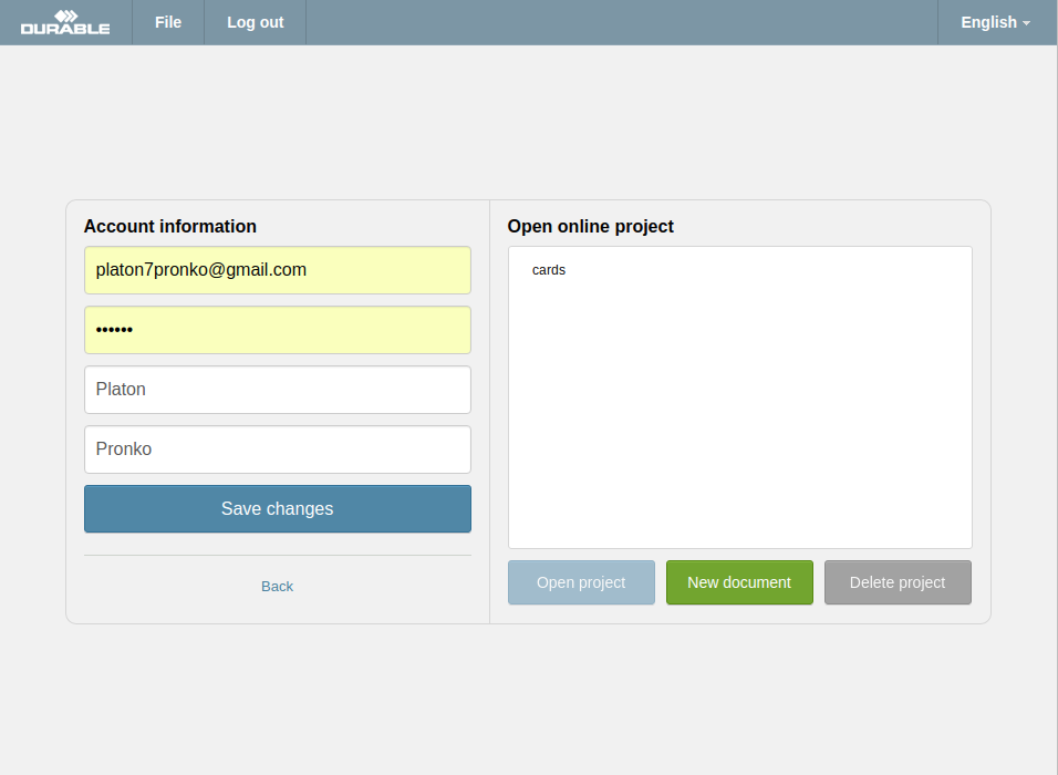
This page is accessible only to the registered users. Here you can update your account information, change the password, and view the list of projects that you saved online.
In order to open your project, select it from the list and click "Open project". If you wish to start a clean project, click "New document".
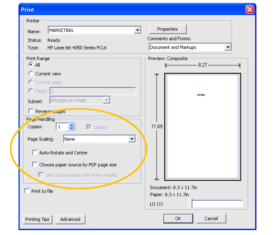
For the best results, we recommend adjusting your printer settings as follows: